2024
Velobe Brand Identity
Designing a visual language to support sustainable urban movement
Velobe is a startup marketplace for used e-bikes, with a mission to make sustainable transportation more accessible and appealing. The brand needed to reflect both the functionality of second-hand biking and the lifestyle shift toward greener urban mobility.
I created the full visual identity: logo, color palette, and core visual elements, and supported the team with design consultation for their website. The goal was to create a brand that feels modern, trustworthy, and aligned with the values of the circular economy and everyday convenience.

Scope
Velobe is a new second-hand e-bike retailer with big ambitions and limited resources. I was brought in to help shape their brand from the ground up, building a strong, scalable identity that could support their launch and evolve as the business grows.
Deliverables
Brand direction and moodboards
Logo, color palette, typography, and image direction
Scalable visual system using brand elements and 3D visuals
Website visual guidance and supporting assets
Social media templates and content examples
Constraints
The brand was in its early stages and working with a limited budget. We needed to create a polished, cohesive identity without relying on expensive content production. The system had to work now, and scale later.

Finding the right direction
We started with remote sessions, open discussions, and moodboarding to explore tone, values, and look and feel. Quick visual sketches helped steer the direction and align the team on a style that felt fresh, confident, and distinct.
Once we locked in the direction, I developed the core identity: logo, type, color, and visual language. The system was designed to be flexible and visually bold — with room to grow. Since the team didn’t yet have budget for lifestyle photography, we leaned into 3D renders and branded objects to build a strong look without the need for custom shoots.


As part of the work, I created a brand book that captures the essential building blocks of the Velobe brand, including the logo, typography, color palette, and visual guidelines.
It serves as a practical tool to keep the brand consistent across channels and teams, and gives a solid foundation for future partners and collaborators as the brand grows.
The brand book evolved alongside the project. We started with just the essentials: logo, colors, and typography, and added new pages as needed. It was a living document that grew as the brand took shape, always focused on what was most relevant at each stage.
Website Direction
While an external partner built the website, I directed the overall look and feel, ensuring the brand translated well into the digital space. My role focused on visual design and brand direction.
I created a style guide, provided visual references, and developed key brand assets to guide the site’s visual tone. This wasn’t a UX project but rather a way to ensure the visual identity held together across channels, including the web.


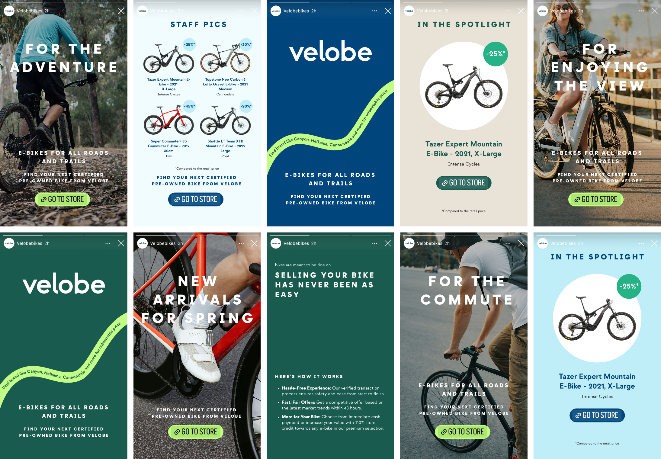
Social media
To support some marketing, I delivered social media templates and example posts. These gave the team a plug-and-play system to maintain consistency across social media marketing, even with limited in-house design resources. The templates were designed to be flexible and easy to use, so the team could create professional-looking posts without needing a dedicated designer.

Bringing the brand to life across touchpoints
In addition to the webstore and social media, the brand extends naturally into real-world environments. The color palette, logotype, and graphic elements were designed to be bold and flexible — working well across packaging, product visuals, merchandise, and event materials. This helps create a consistent and recognizable presence wherever the brand shows up.

